


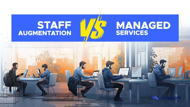
In this digital age, when businesses want to outsource their workers in a more efficient and open way, it is very important to know the
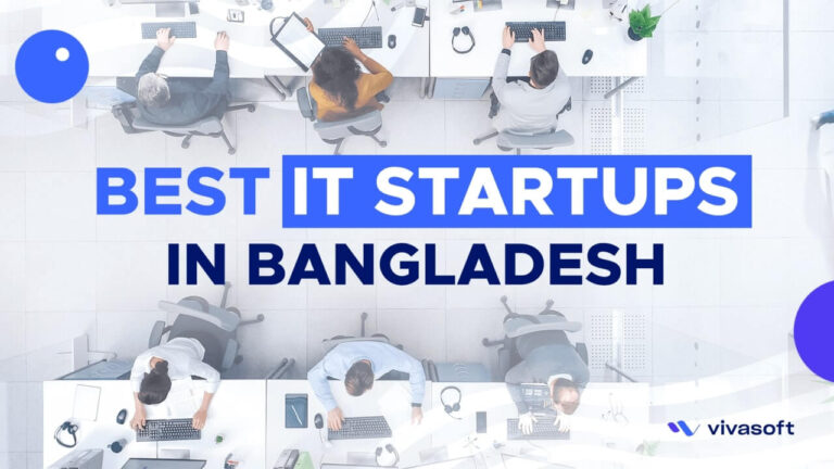
In the realm of technology and innovation, Bangladesh, a nation celebrated for its rich culture and history, is emerging as a dynamic player. At the

MVP Development for Startups MVP Development for Startups, is a very important term for a startup company to use to distribute all the available resources